The Woodfire Bistro

The Woodfire Bistro brings together Italian-inspired cuisine and wood-fired cooking, with a focus on thoughtful ingredients, balanced flavours, and a well-paced dining experience.

Project Overview

Launched

April 2026

Platform

WordPress

Industry

Accommodation & Hospitality, Local Businesses & Services

Services

Branding, WordPress Design & Development

Add-ons

Website Policies, Google Reviews, Website Hosting Plan

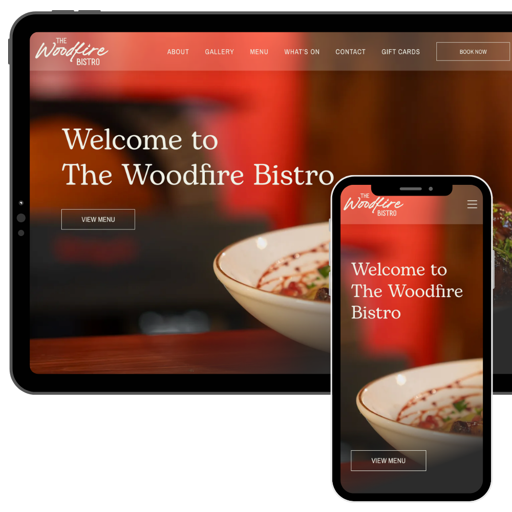
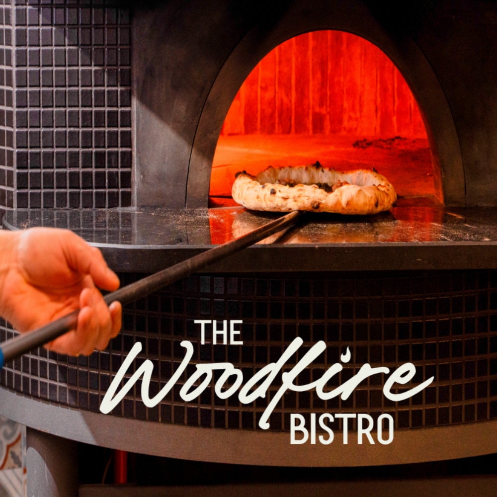
The Woodfire Bistro is a locally owned restaurant bringing Italian-inspired cuisine and wood-fired cooking to Revelstoke.

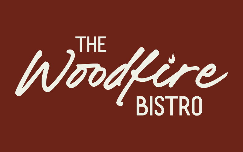
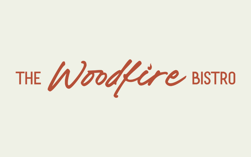
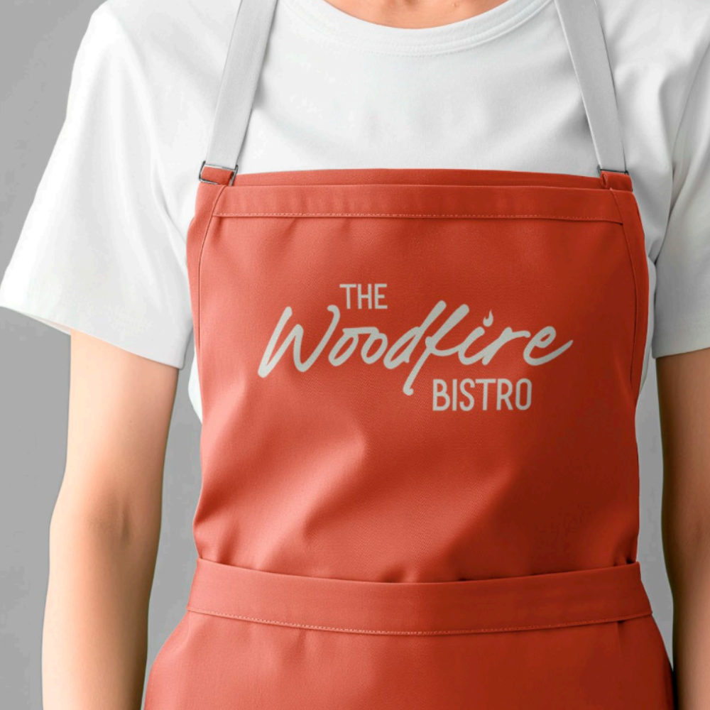
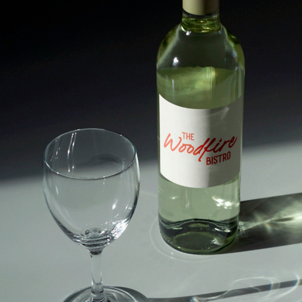
We created a visual identity, including a logo, colour palette, and typography suite. The brand direction reflects the warmth of wood-fired cooking while maintaining a contemporary feel.

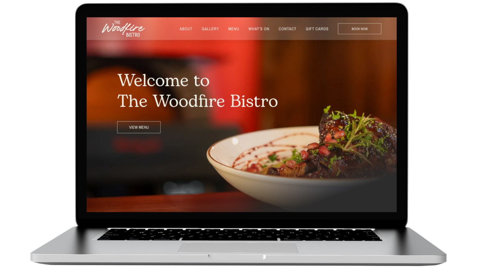
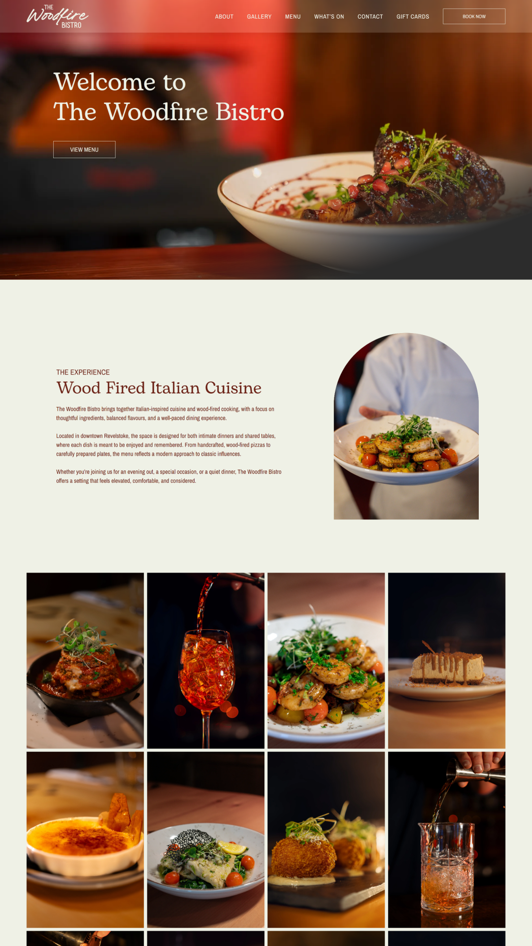
The WordPress website includes a single-page layout alongside a dedicated Menu page, allowing the team to clearly present seasonal offerings and updates. We integrated their third-party reservations platform to ensure seamless table bookings directly from the website. Google reviews were incorporated, along with a Google Trust Badge displaying their rating to reinforce credibility and encourage reservations.

Built to meet WCAG 2 accessibility standards, the site is fully mobile responsive and optimized for performance across all devices. An auto-updating privacy policy ensures continued compliance, while secure website hosting and ongoing maintenance support long-term reliability.

The result is a cohesive brand and digital presence that supports bookings, builds trust, and positions The Woodfire Bistro as a standout dining destination in Revelstoke.

Website Features

Accessible & WCAG-Compliant

Meets WCAG standards for an accessible, user-friendly experience.

Google Analytics

Track website traffic and visitor insights with Google Analytics.

Website Policies

Auto-updating legal policies to protect your business and ensure compliance.

Client Testimonials

Showcase real customer feedback to build trust and credibility.

Google Maps Integration

Make it easy for customers to find and visit your business with an interactive map.

Booking Platform

Allow customers to book appointments, reservations, or services directly from the website.

SEO-Optimized

Structured for better search rankings and online visibility.

Daily Backups

Automated daily backups to safeguard your website and data.

Branding

Primary Logo

The primary logo is the foundation of a brand’s visual identity. It’s the most recognizable mark, designed to be versatile and memorable across all platforms. A well-crafted primary logo sets the tone for the brand, ensuring consistency and professionalism in every application.

Secondary Logo

A secondary logo offers flexibility while maintaining brand recognition. It’s a variation of the primary logo, designed for different layouts, sizes, or applications where the full logo might not fit. Whether it’s a simplified mark, stacked version, or alternate layout, a secondary logo keeps branding cohesive across all platforms.

Brandmark

A brandmark is a simplified, icon-based version of a logo, designed for versatility and quick recognition. Often used without text, it works well in small spaces like social media profiles, favicons, or product packaging. A strong brandmark reinforces brand identity in a minimal yet impactful way.

Colour Palette

A brand’s colour palette plays a key role in creating a strong and recognizable identity. Carefully chosen colours evoke emotion, enhance brand personality, and ensure consistency across all touchpoints. From primary brand colours to complementary accents, a well-balanced palette helps establish a cohesive and visually appealing brand presence.

Brick Red

Minted Cream

Toffee

Blue Slate

Cinnamon Red

Responsive Design

Your customers are browsing on phones, tablets, and desktops. Your website needs to work perfectly on all of them. With over 60% of website traffic coming from mobile devices, a mobile-friendly site isn’t just a bonus, it’s essential.

Google prioritizes responsive sites in search rankings, and a slow or difficult-to-navigate site can send potential customers elsewhere.

That’s why every website we build is fully responsive, ensuring a fast, seamless experience on any screen size.

Whether visitors are on a smartphone, tablet, or desktop, your site will be easy to navigate, read, and engage with. This helps keep customers on your site and ready to take action.

Explore More Projects

See the websites we’ve built for businesses across the Kootenays. We provide professional, responsive, and SEO-optimized web design that helps businesses stand out.