Spruce + Arrow Interior Design Studio

From new construction and renovations to commercial, hospitality and vacation rentals, Spruce + Arrow is up to any challenge.

Project Overview

Launched

May 2023

Platform

WordPress

Industry

Local Businesses & Services

Services

Branding, WordPress Design & Development

Add-ons

Website Policies, Google Reviews, Website Hosting Plan

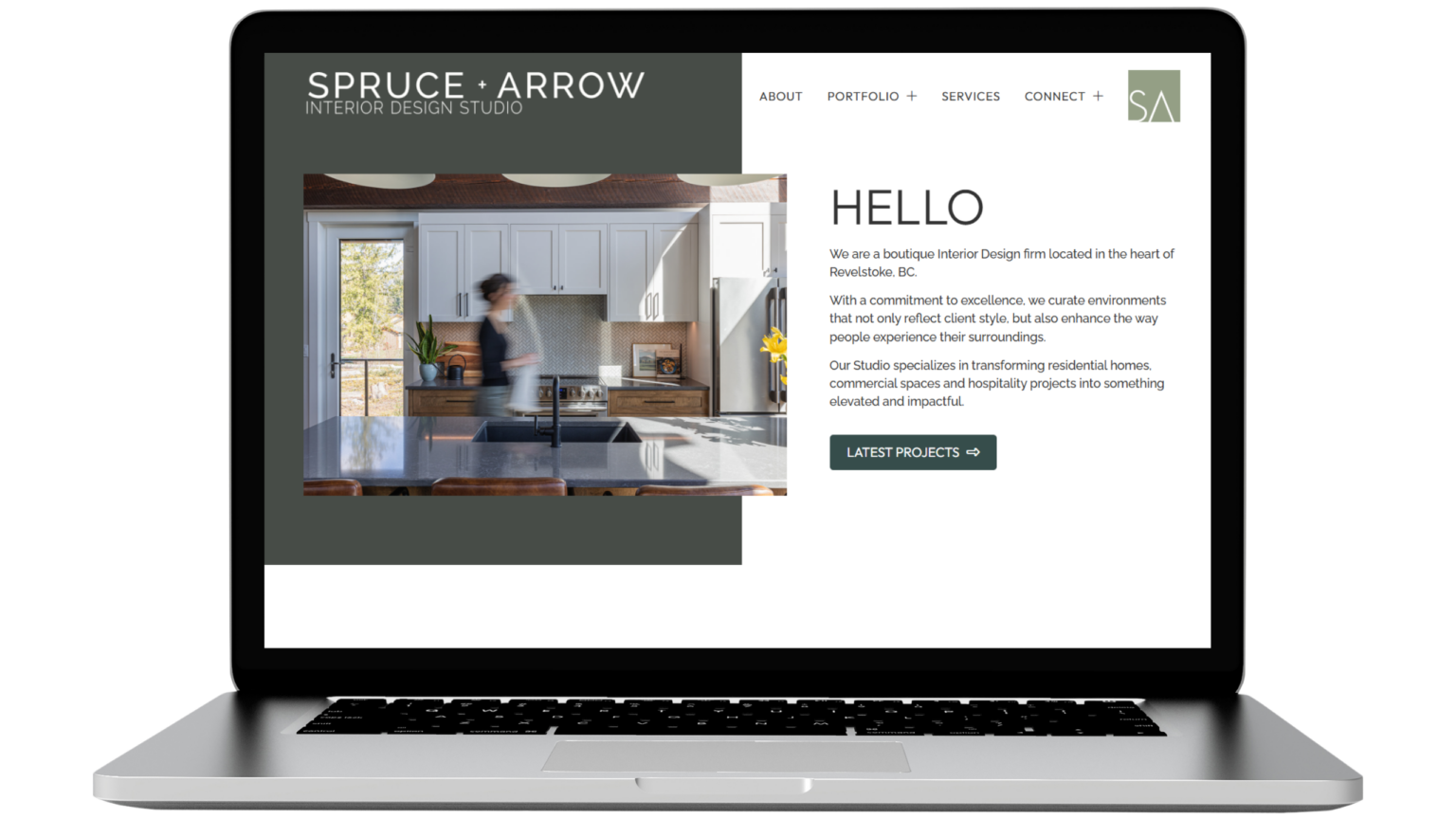
Spruce + Arrow Interior Design Studio is a full-service design firm creating refined, functional spaces across residential, commercial, hospitality, and development projects. Known for their thoughtful material palettes and layered interiors, the studio brings clarity, cohesion, and character to every space they design.

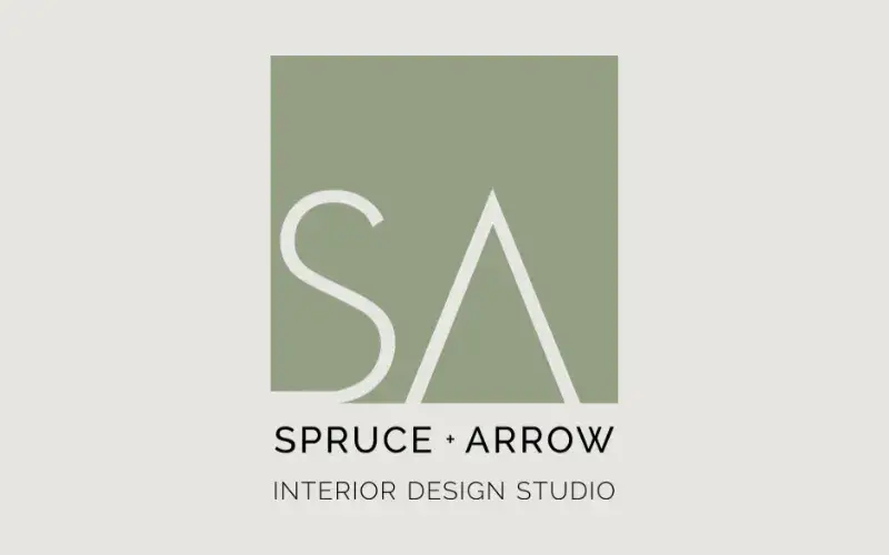
We supported a brand evolution by refining the existing logo and developing a complementary colour palette and typography system. The project also included comprehensive Brand Guidelines and Brand Strategy documents to provide long-term direction and consistency across all touchpoints.

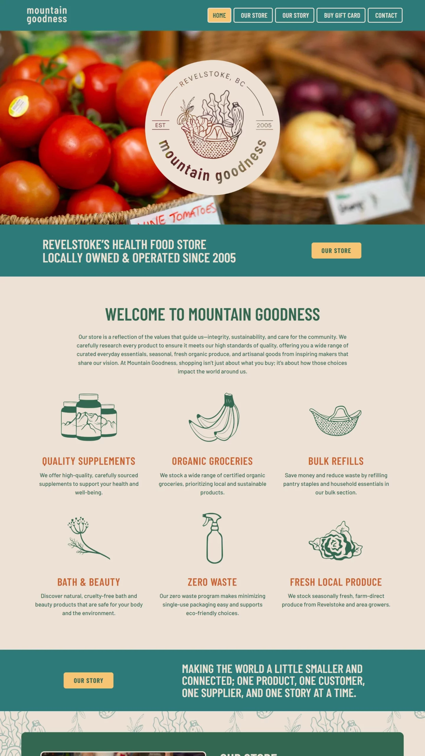
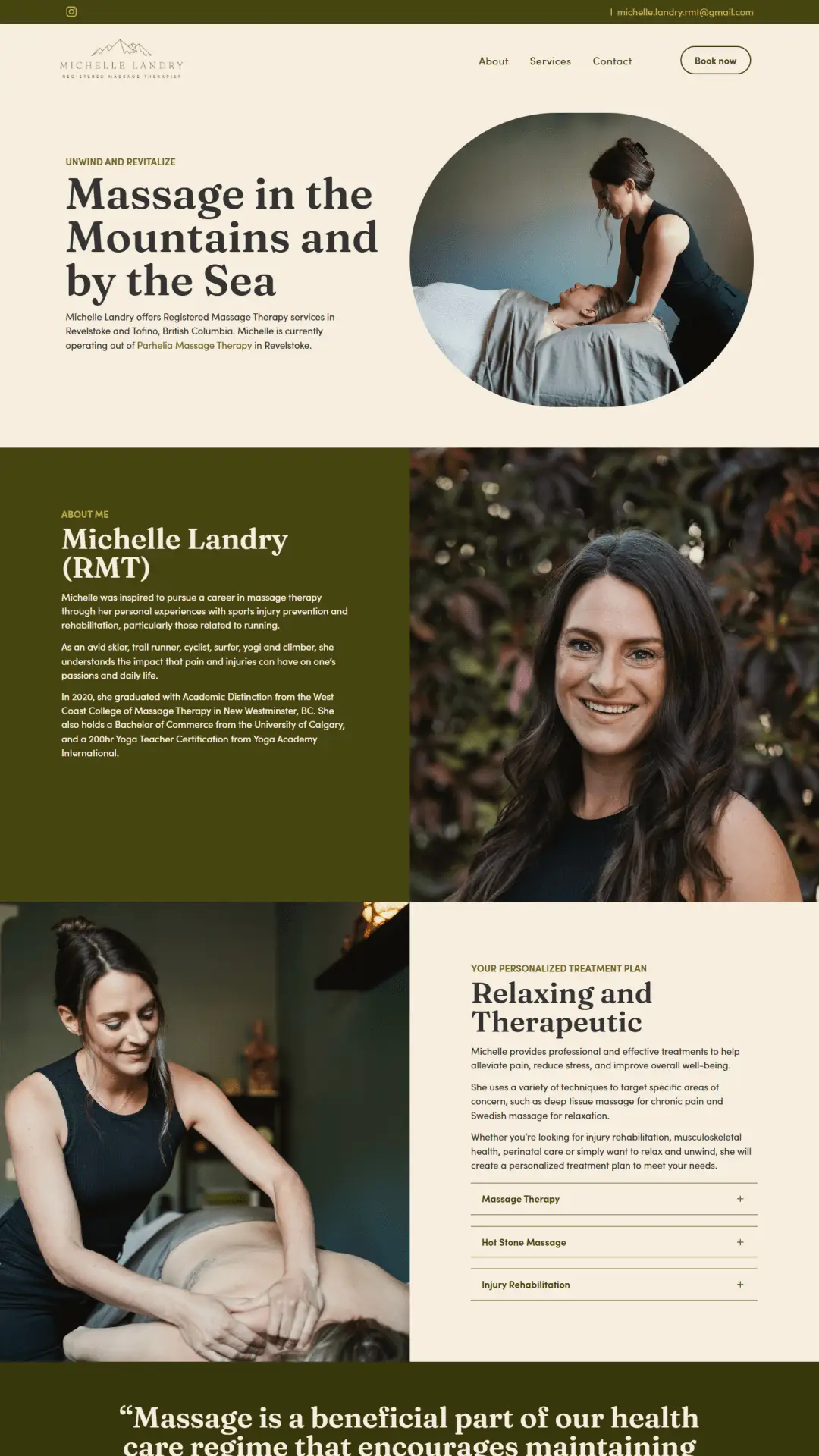
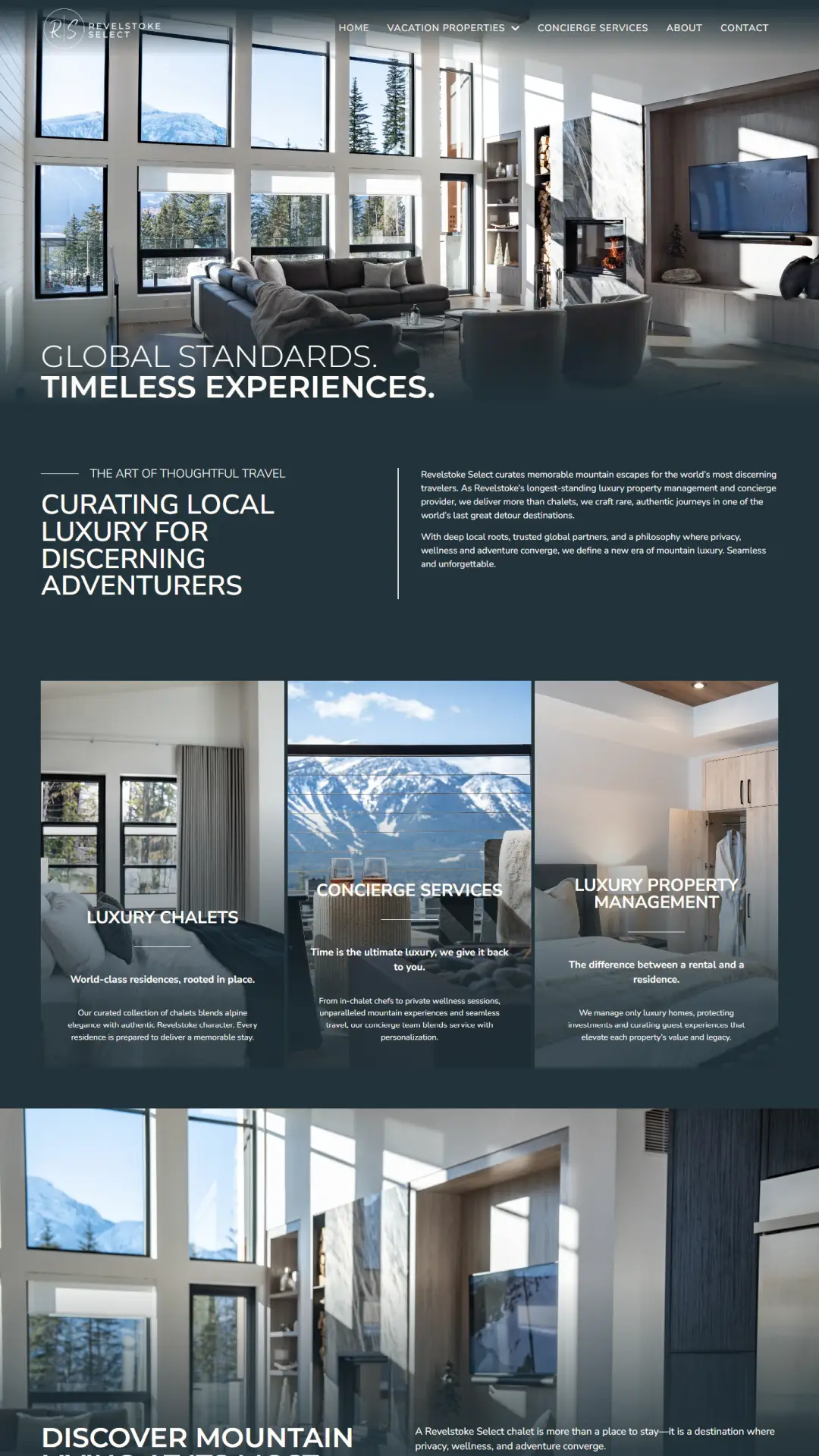
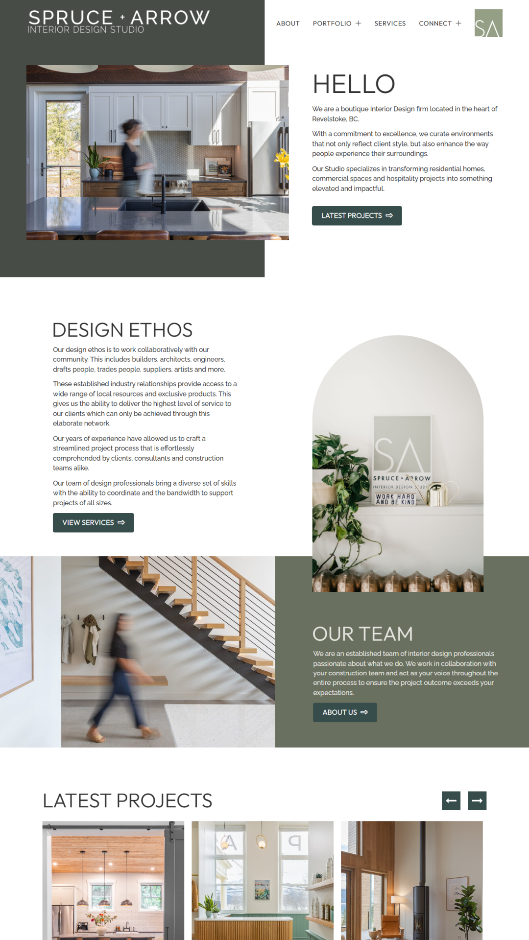
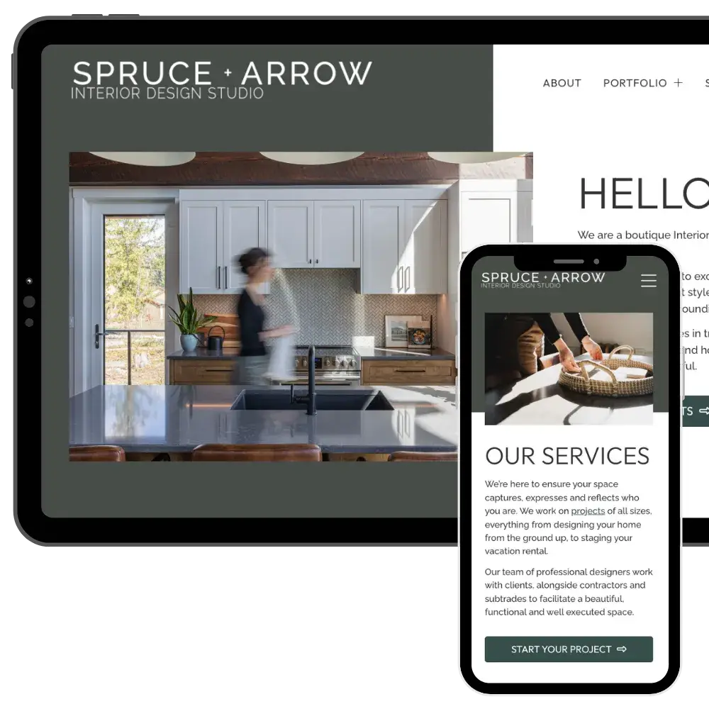
The WordPress website was designed to act as a visual showcase of the studio’s work. A robust portfolio archive organizes projects into residential, commercial, hospitality, and development categories, with large image galleries for each entry to highlight detail and craftsmanship. An integrated Instagram feed keeps the site dynamic and connected to the studio’s ongoing work.

To reinforce credibility, we integrated Google reviews along with a Google Trust Badge displaying their rating. Built to meet WCAG 2 accessibility standards, the site is fully mobile responsive and optimized for performance across all devices. An auto-updating privacy policy ensures continued compliance, while secure website hosting and ongoing maintenance support reliability.

The result is a polished and strategic online presence that reflects Spruce + Arrow’s elevated design aesthetic while supporting visibility, trust, and continued growth.

Spruce and Arrow Full Page

Website Features

Accessible & WCAG-Compliant

Meets WCAG standards for an accessible, user-friendly experience.

Google Analytics

Track website traffic and visitor insights with Google Analytics.

Website Policies

Auto-updating legal policies to protect your business and ensure compliance.

Instagram Feed

Show your latest Instagram posts directly on your website.

Client Testimonials

Showcase real customer feedback to build trust and credibility.

Google Maps Integration

Make it easy for customers to find and visit your business with an interactive map.

FAQs

Smart, searchable FAQ sections, structured for SEO and enhanced with AI tools to improve clarity and discoverability.

SEO-Optimized

Structured for better search rankings and online visibility.

Branding

Primary Logo

The primary logo is the foundation of a brand’s visual identity. It’s the most recognizable mark, designed to be versatile and memorable across all platforms. A well-crafted primary logo sets the tone for the brand, ensuring consistency and professionalism in every application.

Secondary Logo

A secondary logo offers flexibility while maintaining brand recognition. It’s a variation of the primary logo, designed for different layouts, sizes, or applications where the full logo might not fit. Whether it’s a simplified mark, stacked version, or alternate layout, a secondary logo keeps branding cohesive across all platforms.

Brandmark

A brandmark is a simplified, icon-based version of a logo, designed for versatility and quick recognition. Often used without text, it works well in small spaces like social media profiles, favicons, or product packaging. A strong brandmark reinforces brand identity in a minimal yet impactful way.

Colour Palette

A brand’s colour palette plays a key role in creating a strong and recognizable identity. Carefully chosen colours evoke emotion, enhance brand personality, and ensure consistency across all touchpoints. From primary brand colours to complementary accents, a well-balanced palette helps establish a cohesive and visually appealing brand presence.

Dark Grey

Moss Green

Grey Green

Emerald Green

Light Tan

Light Grey

Responsive Design

Your customers are browsing on phones, tablets, and desktops. Your website needs to work perfectly on all of them. With over 60% of website traffic coming from mobile devices, a mobile-friendly site isn’t just a bonus, it’s essential.

Google prioritizes responsive sites in search rankings, and a slow or difficult-to-navigate site can send potential customers elsewhere.

That’s why every website we build is fully responsive, ensuring a fast, seamless experience on any screen size.

Whether visitors are on a smartphone, tablet, or desktop, your site will be easy to navigate, read, and engage with. This helps keep customers on your site and ready to take action.

Explore More Projects

See the websites we’ve built for businesses across the Kootenays. We provide professional, responsive, and SEO-optimized web design that helps businesses stand out.