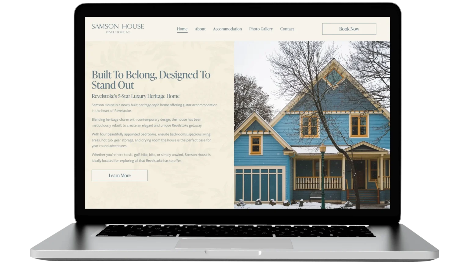
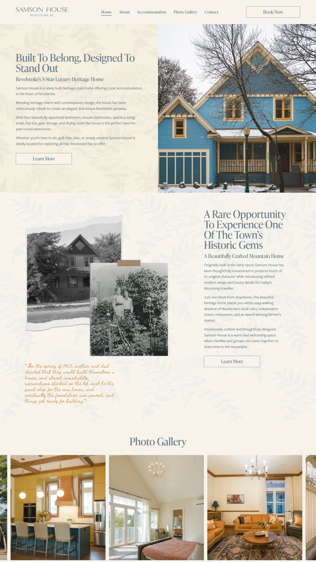
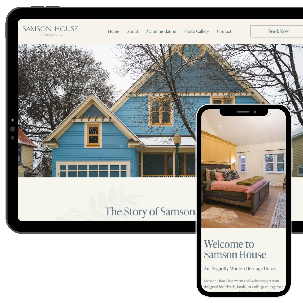
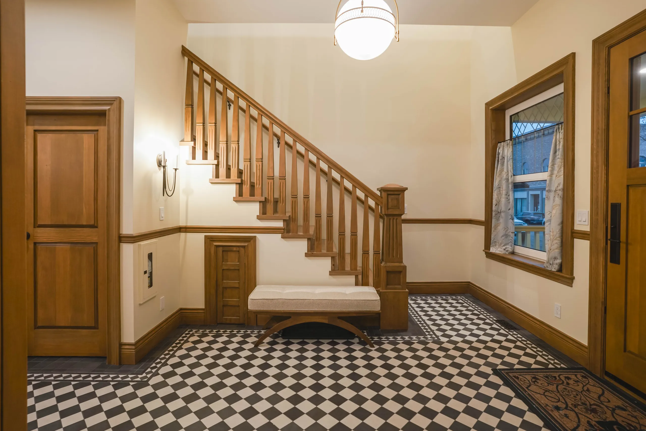
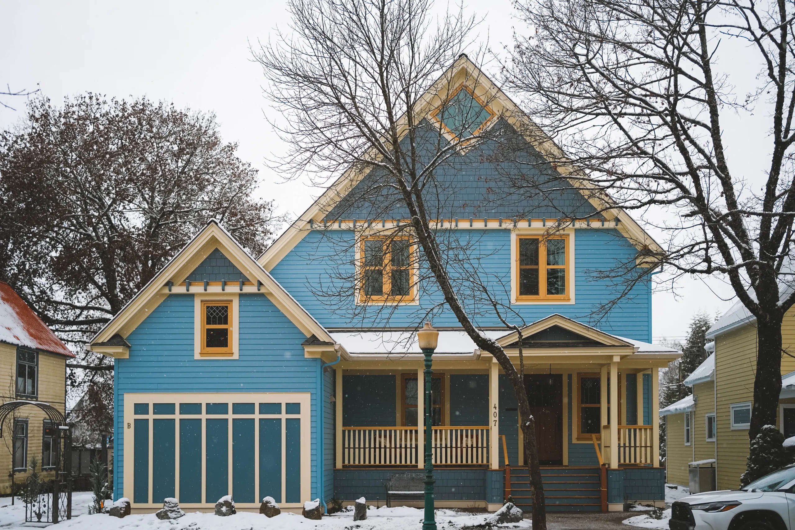
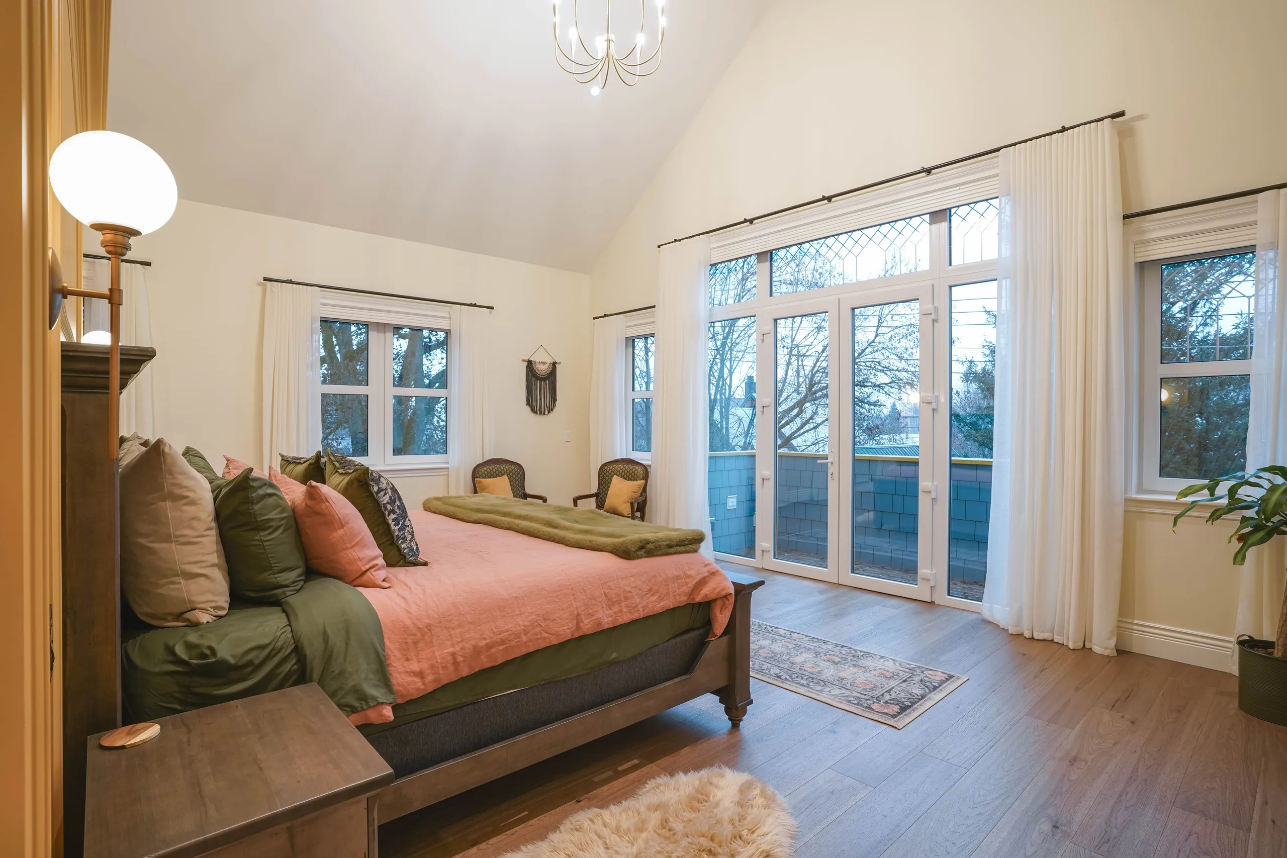
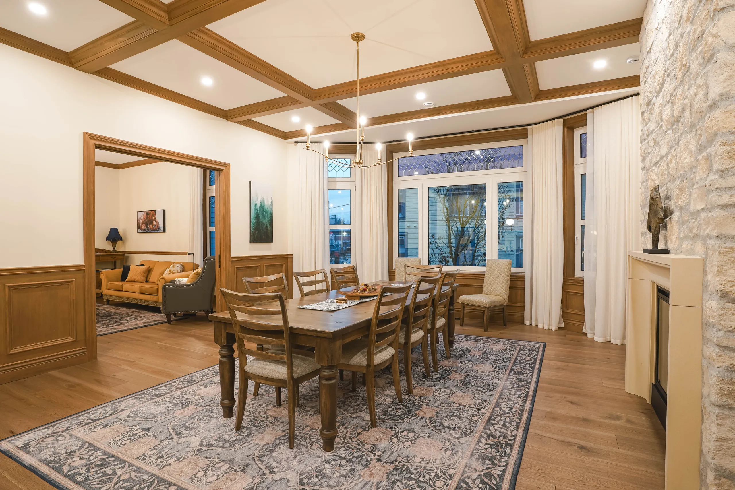
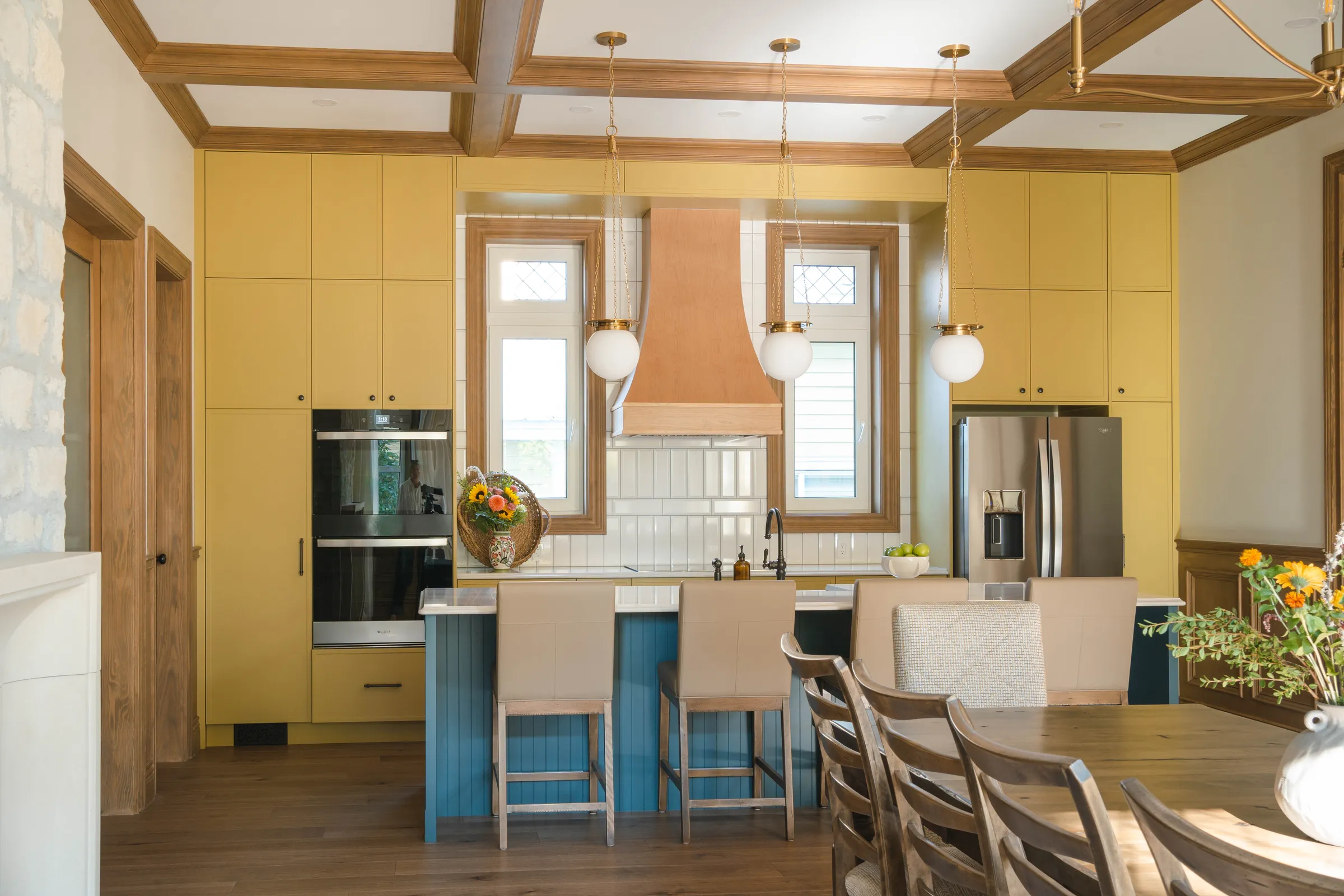
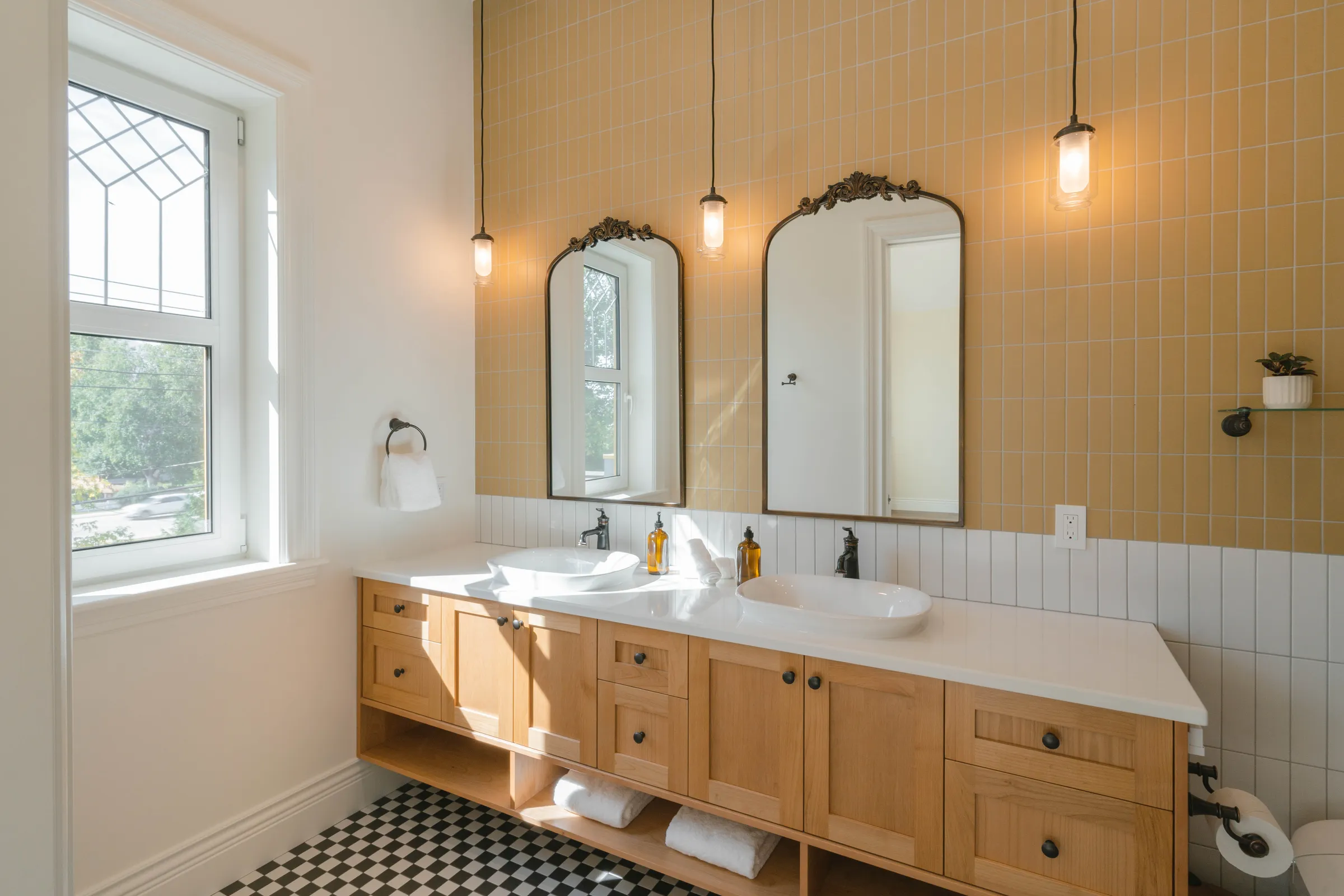
Samson House is a newly rebuilt heritage-style luxury home offering 5-star accommodation in the heart of Revelstoke. Designed for discerning travellers, the property blends historic character with contemporary comfort to create a refined, design-led mountain retreat.
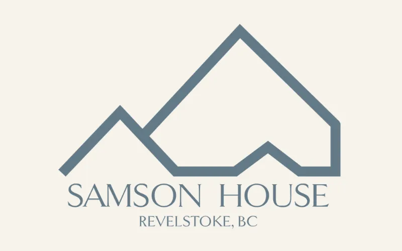
We developed a complete brand identity for Samson House, including brand guidelines, a custom logo, typography, and cohesive colour palette to match the Benjamin Moore paint chosen for the house interior. The WordPress website was designed and built to reflect the home’s heritage roots while presenting a polished, modern aesthetic. The site is fully responsive, WCAG 2 compliant, and structured for clarity and ease of use across all devices.
The website features a carefully curated layout with galleries that showcase the craftsmanship, interiors, and setting of the home. An auto-updating privacy policy ensures ongoing compliance and peace of mind for guests.
The website copy was written by Kootenay.design, highlighting the home’s history, thoughtful reconstruction, and appeal as a high-end base for year-round adventure. The final result positions Samson House as a distinctive luxury stay, designed to attract premium bookings while honouring Revelstoke’s architectural heritage.
