Carl Kuster Mountain Park

As leaders within the backcountry guiding community Carl Kuster Mountain Park is always pushing innovation within the sport of snowmobiling.

Project Overview

Launched

October 2024

Platform

WordPress

Industry

Outdoor Adventure & Recreation

Services

Branding, Shopify, WordPress Design & Development

Add-ons

Website Policies, Google Reviews, Website Hosting Plan

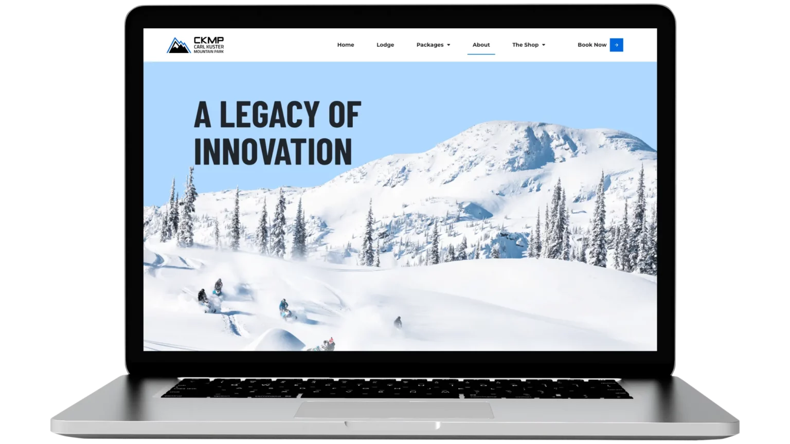
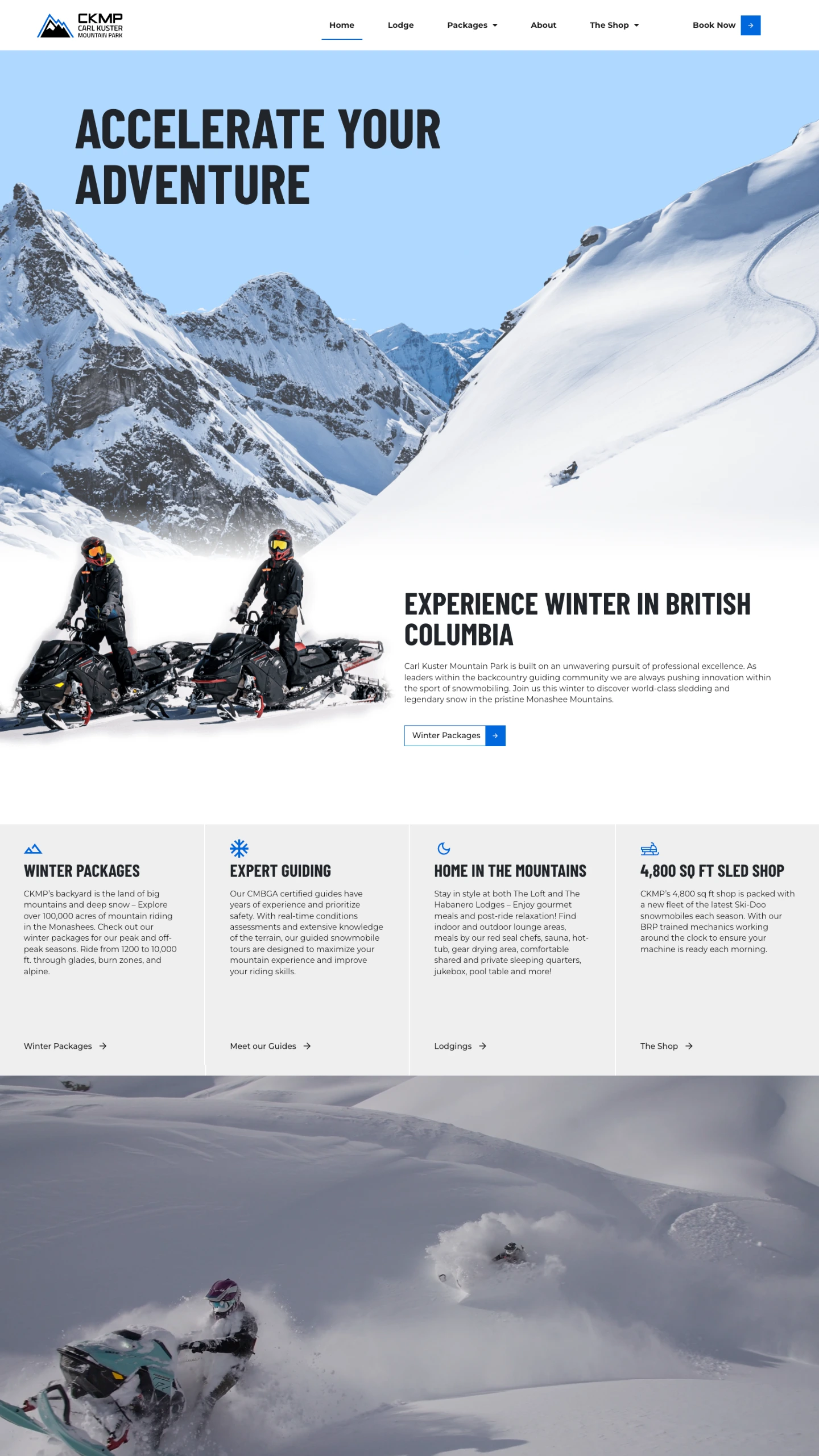
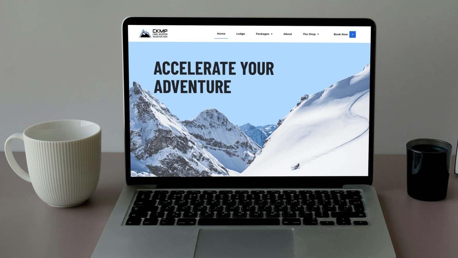
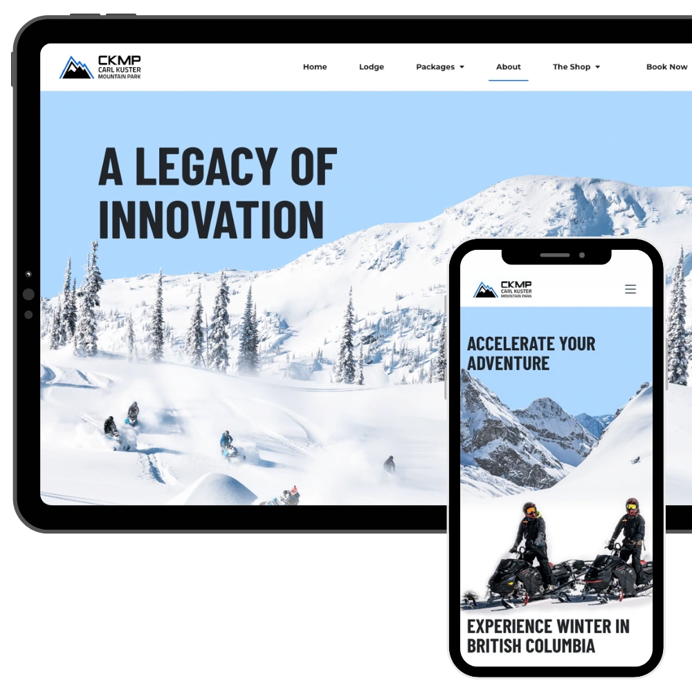
Carl Kuster Mountain Park is built on an unwavering pursuit of professional excellence. As leaders within the backcountry guiding community they are always pushing innovation within the sport of snowmobiling.

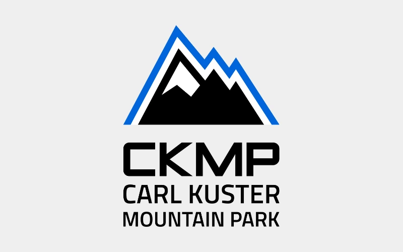
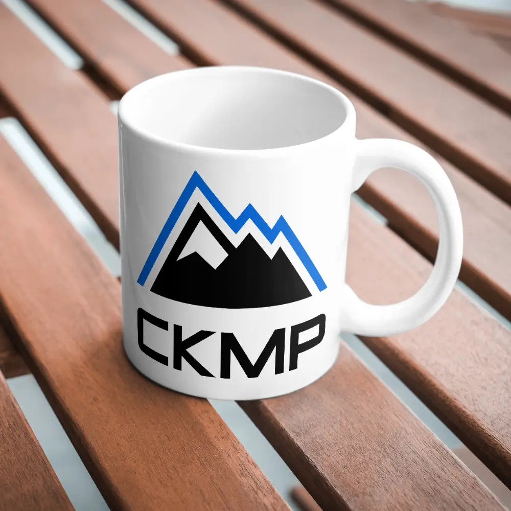
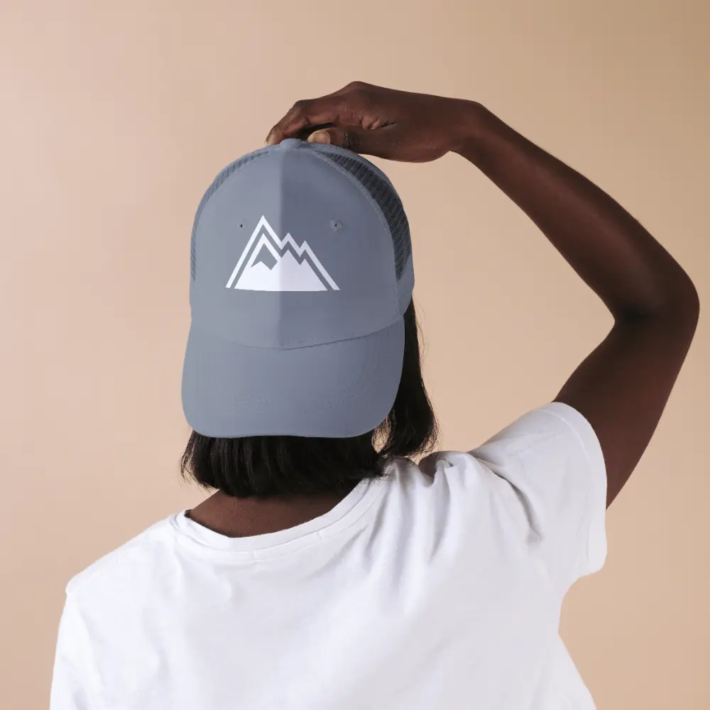
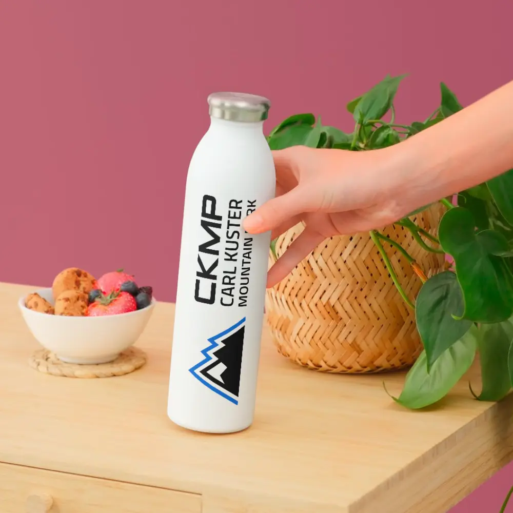
Our graphic designer revitalized their brand by refreshing the logo, colour palette, and typography, while crafting a bold, visually-striking website design. The site features stunning full-screen images that flow seamlessly, creating an immersive experience that captures the thrill of CKMP’s world-class adventures. Built by our skilled developers, the site is fully responsive, meets WCAG 2 Guidelines for accessibility, and is enhanced with advanced SEO for maximum online visibility.

We integrated CKMP’s Google Business Profile to showcase their excellent rating and added features such as a newsletter signup and a live Instagram feed to keep visitors engaged and connected. Clear, adventure-driven content written by our talented copywriter highlights CKMP’s exceptional facilities and experiences. To ensure compliance, we included an auto-updating privacy policy. This polished website and updated branding perfectly convey the excitement, professionalism, and expertise CKMP is known for.

Website Features

Accessible & WCAG-Compliant

Meets WCAG standards for an accessible, user-friendly experience.

Google Analytics

Track website traffic and visitor insights with Google Analytics.

Website Policies

Auto-updating legal policies to protect your business and ensure compliance.

Client Testimonials

Showcase real customer feedback to build trust and credibility.

Google Maps Integration

Make it easy for customers to find and visit your business with an interactive map.

Newsletter Signup

Grow your email list and keep customers engaged with updates and offers.

SEO-Optimized

Structured for better search rankings and online visibility.

Daily Backups

Automated daily backups to safeguard your website and data.

Branding

Primary Logo

The primary logo is the foundation of a brand’s visual identity. It’s the most recognizable mark, designed to be versatile and memorable across all platforms. A well-crafted primary logo sets the tone for the brand, ensuring consistency and professionalism in every application.

Secondary Logo

A secondary logo offers flexibility while maintaining brand recognition. It’s a variation of the primary logo, designed for different layouts, sizes, or applications where the full logo might not fit. Whether it’s a simplified mark, stacked version, or alternate layout, a secondary logo keeps branding cohesive across all platforms.

Brandmark

A brandmark is a simplified, icon-based version of a logo, designed for versatility and quick recognition. Often used without text, it works well in small spaces like social media profiles, favicons, or product packaging. A strong brandmark reinforces brand identity in a minimal yet impactful way.

Colour Palette

A brand’s colour palette plays a key role in creating a strong and recognizable identity. Carefully chosen colours evoke emotion, enhance brand personality, and ensure consistency across all touchpoints. From primary brand colours to complementary accents, a well-balanced palette helps establish a cohesive and visually appealing brand presence.

Blue

Light Grey

Charcoal Black

Light Blue

Dark Grey

Dark Dusty Blue

Responsive Design

Your customers are browsing on phones, tablets, and desktops—your website needs to work perfectly on all of them. With over 60% of website traffic coming from mobile devices, a mobile-friendly site isn’t just a bonus—it’s essential.

Google prioritizes responsive sites in search rankings, and a slow or difficult-to-navigate site can send potential customers elsewhere.

That’s why every website we build is fully responsive, ensuring a fast, seamless experience on any screen size.

Whether visitors are on a smartphone, tablet, or desktop, your site will be easy to navigate, read, and engage with—helping you keep customers on your site and ready to take action.

Explore More Projects

See the websites we’ve built for businesses across the Kootenays. We provide professional, responsive, and SEO-optimized web design that helps businesses stand out.